.png)
.png) 2 hours ago
3
2 hours ago
3
The Legend of Zelda franchise is easily one of Nintendo’s most celebrated jewels, mostly because it constantly finds ways to reinvent itself through memorable characters, ingenious gameplay mechanics, and also hypnotizing visuals – and if there is one thing we can never complain about when it comes to a Zelda title, it's weak art direction.
This has never been truer than recently, following the announcement of the highly anticipated Ocarina of Time remake, which immediately sparked a debate across the community regarding its brand-new art style. While a chunk of the fandom loved it, either because they think it simply looks good or because it captures what the original developers envisioned but with modern technology, others found the aesthetic a bit uncanny, giving off way too many generic Unreal Engine project vibes.
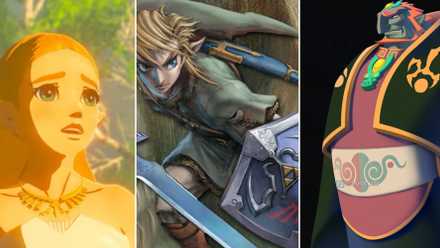 Related
Every 3D Zelda Game, Ranked
One list to (Hy)rule them all.
I have to confess that I fall into that second group, but if there’s one thing I know I can always rely on, it’s that Nintendo’s art teams have never truly failed me. And all this chatter got me nostalgic, making me want to look back and celebrate the best visual styles the franchise has given us over the decades.
10 Link’s Awakening Remake
A Dream Inside a Toybox
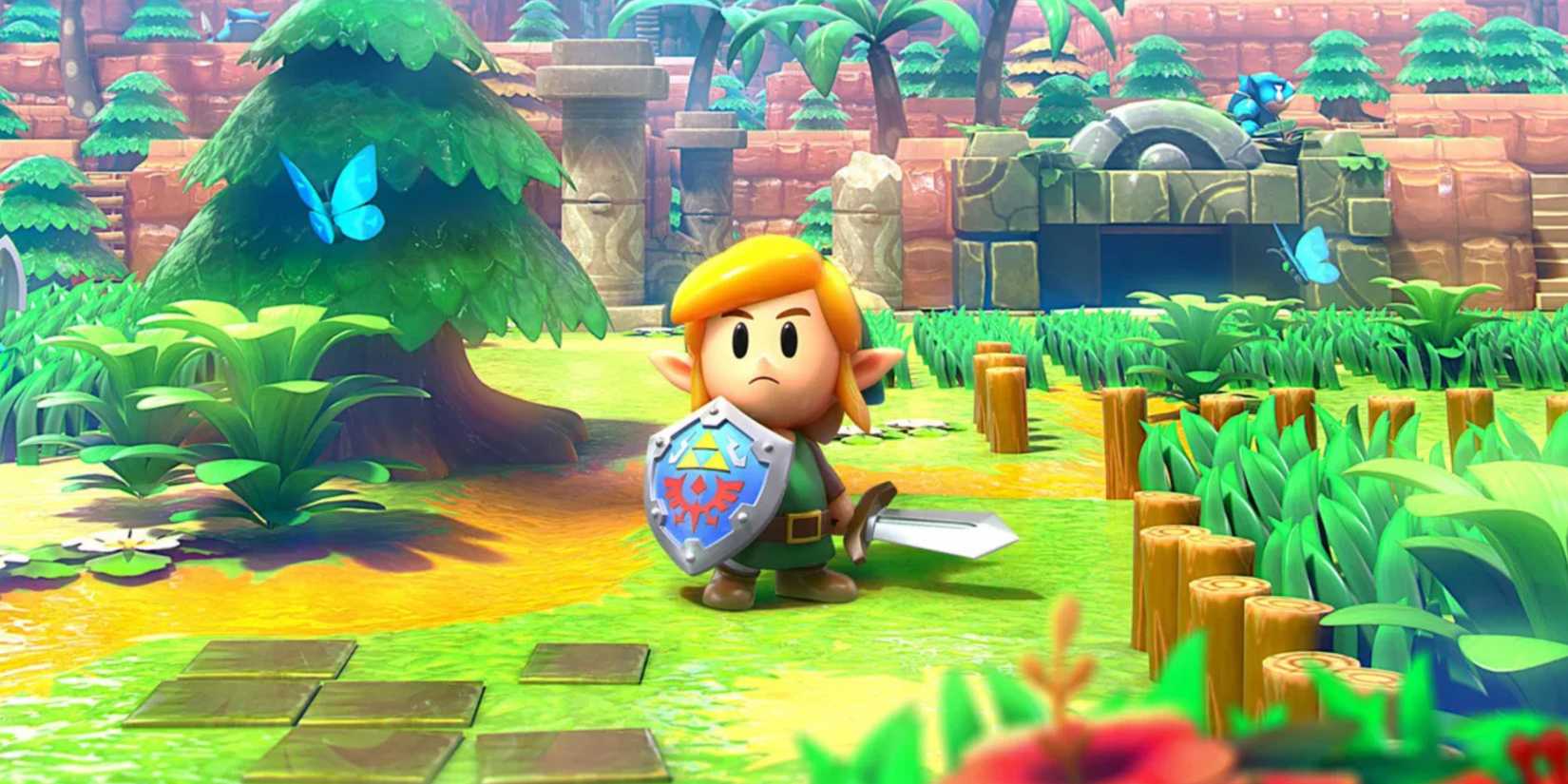
The Legend of Zelda: Link's Awakening
The original Game Boy version of Link’s Awakening was already a portable masterpiece, but the Nintendo Switch remake somehow managed to stay perfectly true to that 8-bit essence while honoring the original narrative in a beautiful way – all by introducing a brilliant, incredibly creative 3D diorama style.
The game reimagines the classic, playful top-down adventure to make Link, the colorful NPCs, the grid-like dungeons, and the environments look like shiny plastic toys, making you feel like an outside observer peering down into a living miniature world, which I honestly adore.
Since this adventure takes place outside of Hyrule and revolves around the surreal quest to awaken a magical sleeping deity, the toy-box aesthetic fits the dreamy tone perfectly – almost as if we are taking a whimsical peek directly inside Link’s mind. I might be overthinking the lore a bit there, but my main point stands: the remake is just too gorgeous and far too cute to ignore.
9 A Link to the Past
Classic 2D Zelda Also Shiny
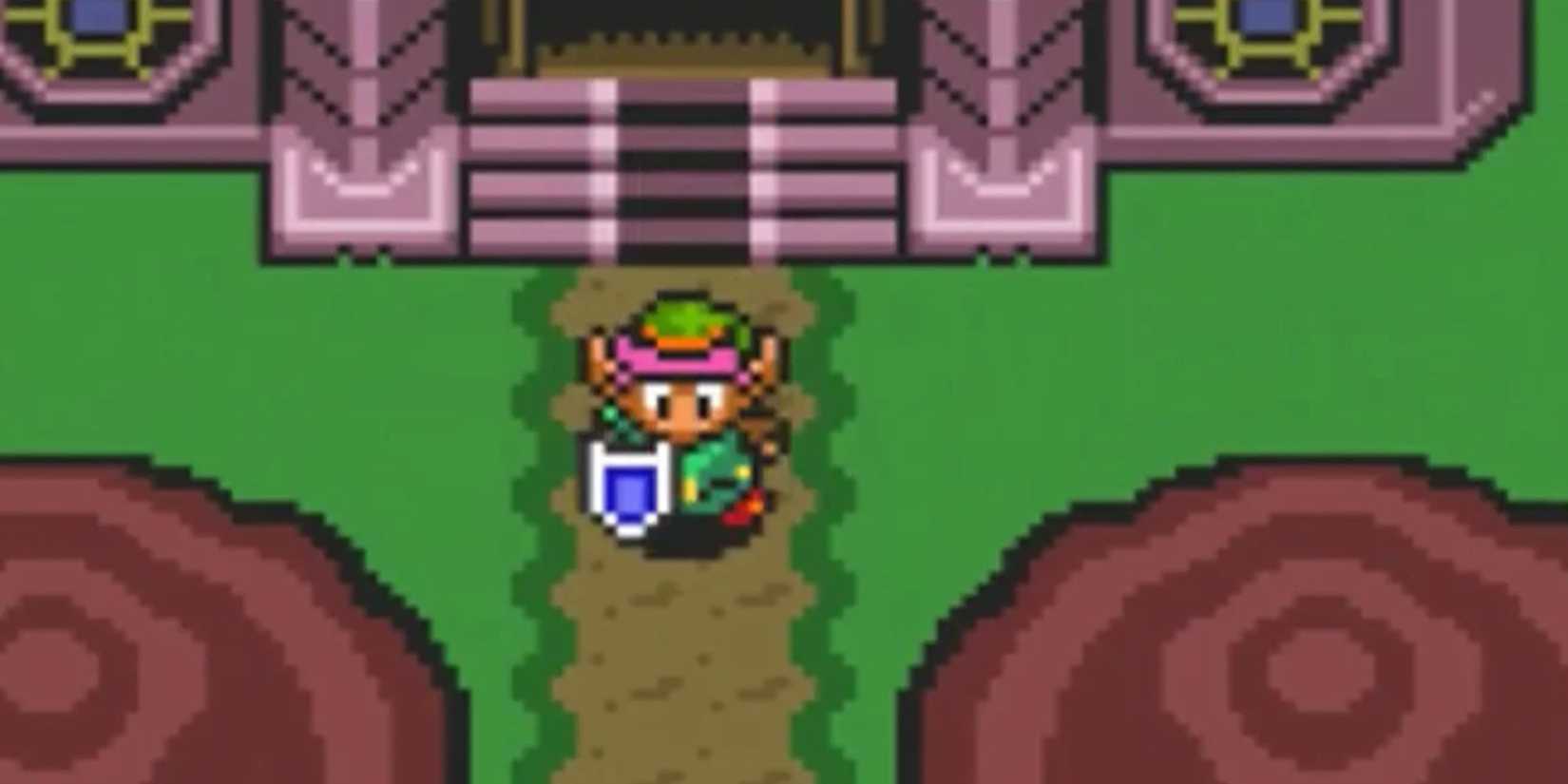
The Legend of Zelda: A Link to the Past
This is where I get to drop the classic "old but gold," because it is simply impossible to talk about defining art directions in gaming without bowing down to the legendary A Link to the Past.
Sure, when we look back at this Super Nintendo gem, we usually praise its narrative and the mid-game plot twist that caught everyone completely off guard back then. But it’s the timeless pixel art that makes the world of Hyrule feel engaging enough for that twist to land so beautifully in the first place.
Delivering what basically felt like two full games in one meant the artists had to craft completely distinct visual layouts for the Light and Dark worlds, design unique dungeons, and build a roster of readable enemies. So it didn't just function smoothly, but also set the golden standard for 2D design.
8 The Minish Cap
Gotta Love a Handheld Pixel Art
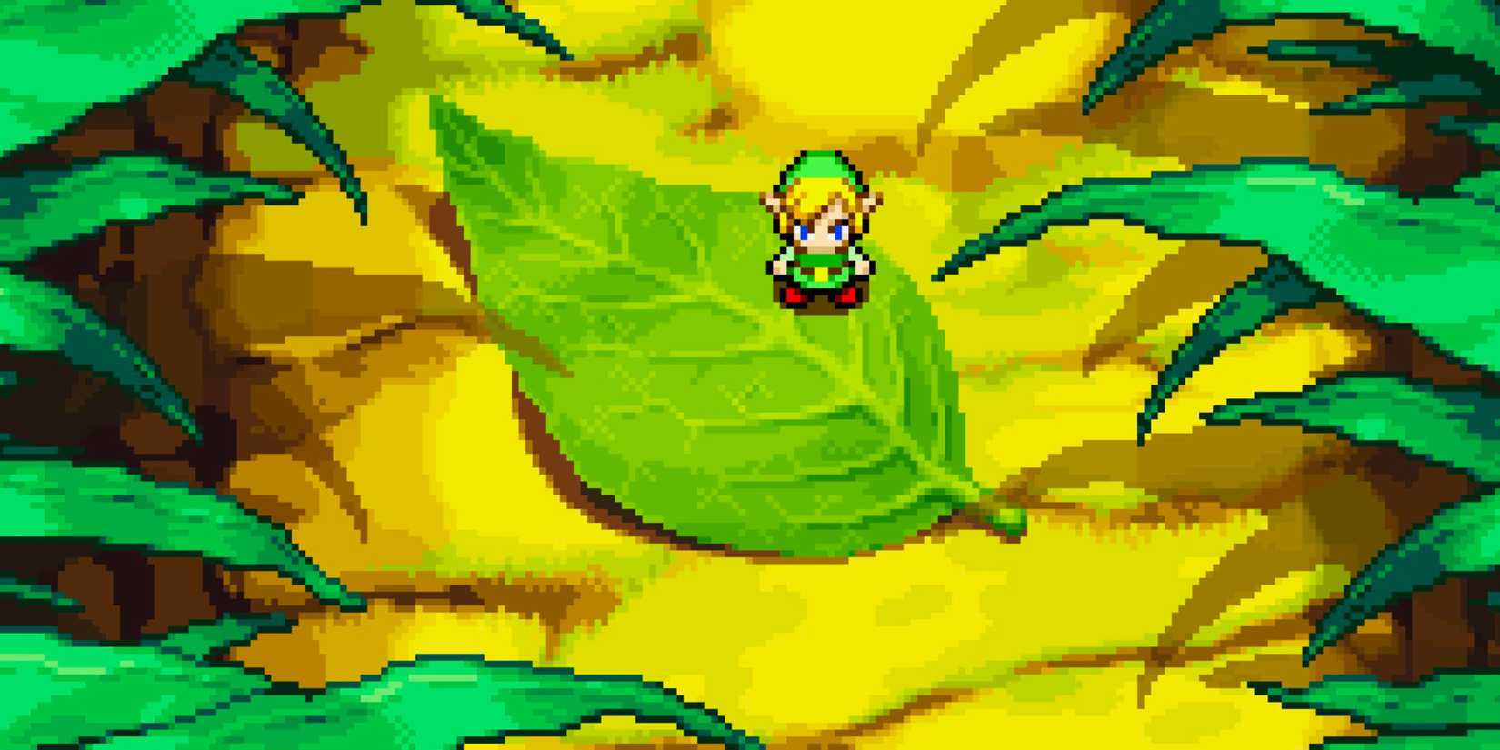
The Legend of Zelda: The Minish Cap
I often feel like The Minish Cap doesn’t get nearly as much love as it deserves, which is a tragedy because it is a definitive gem of the Game Boy Advance library and easily the best-looking pixelated Zelda game ever made.
You notice how impeccable the graphics and animations are from the very first second you press start, and the game utilizes an incredibly vibrant, colorful palette that perfectly resonates with its whimsical premise: the introduction of Ezlo, a magical talking cap that allows Link to shrink down to the size of the microscopic Picori people.
It is a lovely, fairytale-esque concept that blends flawlessly with the art direction. From the bouncy character sprites and balanced puzzles to the creative power-ups and the menacing design of Vaati, the evil mage, every single frame just feels like a gorgeous, hand-crafted cartoon.
7 A Link Between Worlds
A Dimensions-Crossing Translation
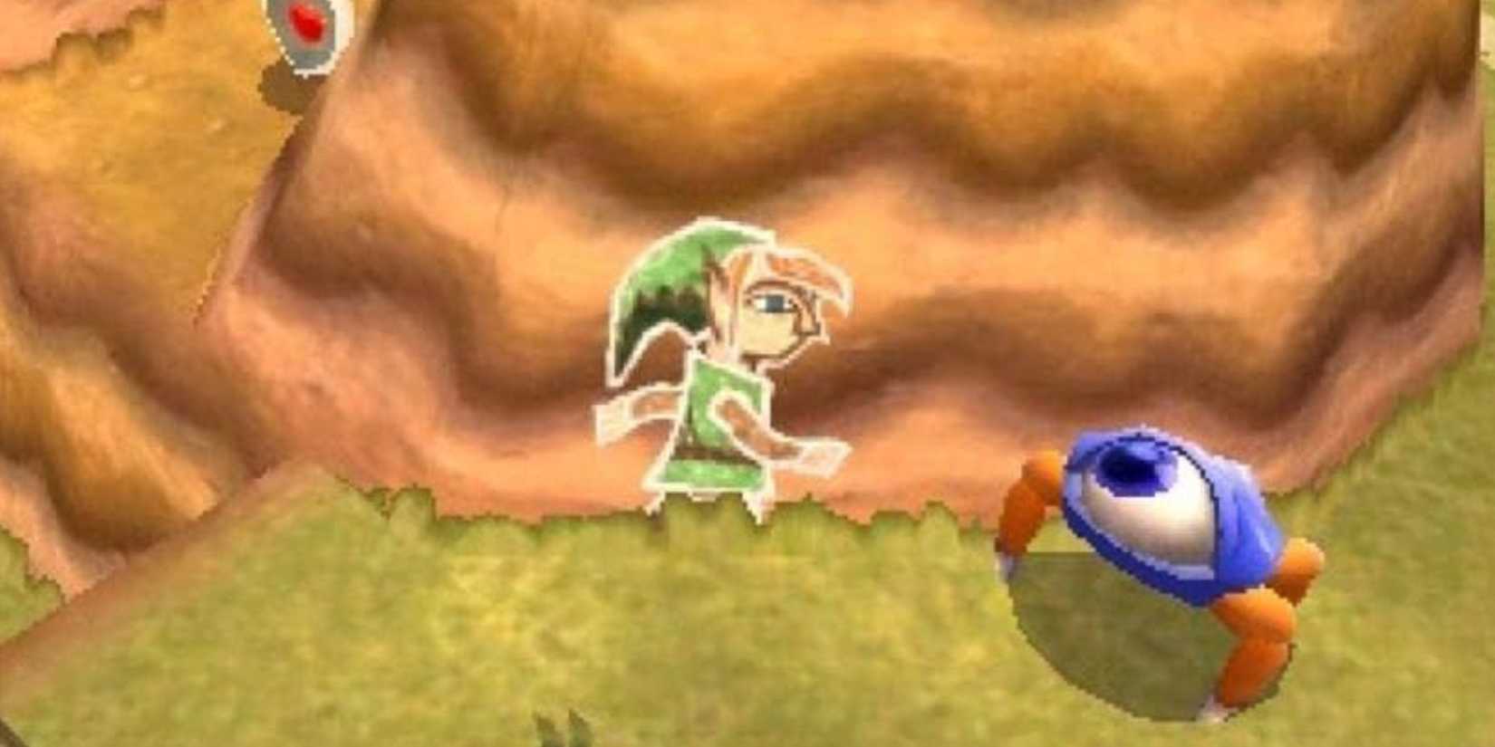
The Legend of Zelda: A Link Between Worlds
A Link Between Worlds isn't just a phenomenal sequel to A Link to the Past, but a brilliant visual mix of the best top-down aspects of the 16-bit era with the expressive charm seen in The Minish Cap and the portable 3D experimentation of Phantom Hourglass.
And I love how this title modernizes the layout of its predecessor without straying from the tone and nostalgic feeling of the original sprites, blending traditional 2D gameplay with clever 3D depth. The environmental objects really feel like perfect, textured polygonal translations of their retro counterparts!
So, by using crisp 3D models coupled with a diorama-like camera angle, the art team managed to deliver expressive character animations and intricate, vertical environments without ever sacrificing that classic, nostalgic gameplay feel we fell in love with decades ago.
 Related
10 Zelda ROM Hacks that are Basically New Games
Your favorite classics rebuilt from the ground up!
6 Twilight Princess
A Dark Fantasy Dream
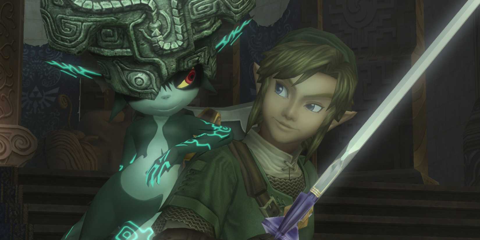
The Legend of Zelda: Twilight Princess
I am a sucker for a dark aesthetic, and there is just something inherently hypnotic about the atmosphere of Twilight Princess. It attempts a grounded, realistic touch while wrapping the entire kingdom in an unsettling, dark fantasy cloak that is hard to put into words – you just have to feel.
A large part of why this look works so well is because the narrative leans heavily into a corrupted, twilight-covered world lurking in the shadows of Hyrule, and the visual contrast is spectacular. Plus, it gave us Midna, who is hands-down the best companion character in the entire franchise, and the creature and boss designs are spot-on. I mean, just to give some examples, Zant is both unsettling and way too cool at the same time, and possessed Zelda is quite a scary sight too!
Upon release, Twilight Princess blew me away, and I still remember that initial visual impression fondly. The only reason it isn’t sitting higher on our list is that strict “realistic” graphics naturally age faster, and looking at it today, the moody atmosphere is still top-tier, but the textures show their age compared to its more stylized siblings.
5 Breath of the Wild
The Living Watercolor Canvas

The art direction of Breath of the Wild (and consequently its successor, Tears of the Kingdom) is precisely what makes Link’s open-world journey feel like a breathtaking, interactive epic. And the developers managed to do that by combining anime-inspired, cel-shaded characters with a soft, watercolor environment heavily reminiscent of a Studio Ghibli film.
It is a stunning, impressionistic style that allows every single ruined temple and grassy plain to look like a literal painting, ensuring the game ages gracefully over time. It famously launched right alongside the original Nintendo Switch hardware, yet its art direction is so strong that it could easily pass as a launch title for a next-generation system because it simply looks that phenomenal.
What I love most about it is how the style intentionally embraces a contrast to reality. Instead of chasing photorealism, the team focused on making the world feel refreshing and alive by exaggerating colors, environmental lighting, and weather shapes. That is exactly where its visual magic lies.
4 Ocarina of Time
The Cinematic Birth of 3D Realism

Ocarina of Time was fundamentally designed to showcase the revolutionary, polygon-crunching power of the Nintendo 64, making 3D graphics a tangible reality at a time when the concept was still relatively new to the world – and thanks to Star Fox, which is a story for another article (that I already told, by the way!).
And by building a fully three-dimensional kingdom from scratch, Nintendo delivered one of the most romanticized, iconic art directions in the medium's history. Everything in Hyrule felt like a beautiful, grand dream, boasting a cinematic scale that was unprecedented for its era. I still remember waking up early on lazy Sunday mornings just to play this with my dad, both of us staring at the screen awestruck by its stylized realism.
And sure, looking back at the original hardware now, the low-resolution textures and blocky character models might seem a bit dated. But you can't deny that true art direction is something you feel in your soul, and that nostalgic, polygonal charm still works beautifully to this day.
3 Majora’s Mask
A Dark OoT

While Majora’s Mask is often looked at as the weird, eccentric sibling to Ocarina of Time, famous for reusing a good amount of the previous game's assets, the reason it ranks so high on our list is that it accomplishes a near-impossible artistic feat: taking existing models and building a unique identity on top of them.
The art team accomplished this by injecting a surreal, somber touch that completely dictates the pacing of the entire game, from the eerie details of the twisted environments to the bizarre designs of the citizens you meet. It’s no surprise that the alternate transformation masks (like Deku Link or Mikau), the off-color fairies, the chaotic architecture of Clock Town, and the iconic Majora’s Mask itself remain some of the most recognizable imagery in gaming culture.
Also, it’s hard to find a Zelda fan who doesn’t own a piece of this game's elements – I literally have a full-sized replica of Majora's Mask hanging on my wall staring at me all day. So Majora's Mask isn't just a game, but a vibe, and we have the art direction to thank for that!
 Related
8 Changes We Want to See in The Legend of Zelda: Ocarina of Time Remake
These are changes we want to see implemented in The Legend of Zelda: Ocarina of Time Remake.
2 Skyward Sword HD
An Impressionist Art Refined

The Legend of Zelda: Skyward Sword HD
The original Skyward Sword on the Nintendo Wii was already a visually stunning concept, but it was held back by the hardware constraints of its era, resulting in jagged edges and muddy, low-res textures that looked blurry during close-ups. Thankfully, the HD version on the Nintendo Switch ironed out all those technical wrinkles, finally allowing the chronological beginning of the Zelda timeline to radiate with its true, intended brilliance.
The game brilliantly merges the expressive cel-shaded character work of The Wind Waker with the epic proportions of Twilight Princess, utilizing a distinct impressionist, watercolor aesthetic inspired by classical painters.
That way, the landscapes are breathtaking, with distant mountains and floating islands that blur into soft, sweeping brushstrokes, while the color palette shifts dynamically to match the emotional weight of your surroundings – ranging from warm, radiant sunshine in Skyloft to deep, mysterious tones inside ancient dungeons and corrupted woods. So it basically transforms the world into a living, breathing canvas that is practically impossible not to fall in love with.
1 The Wind Waker
The Ageless Cartoon Chapter

The Legend of Zelda: The Wind Waker
I still vividly remember some players’ meltdown when The Wind Waker was first unveiled. The idea of trading a gritty, realistic Link for a cartoonish, wide-eyed cel-shaded boy felt like a betrayal to many hardcore fans at the time. Yet, I challenge you to find a single gamer today who isn't completely head-over-heels in love with this game's visual identity.
Its timeless, cel-shaded graphics didn't just look incredible. They were actually vital to capturing the whimsical spirit of playing through a long-lost maritime legend. The expressive, fluid animations gave Link a soul unlike anything before, making it a joy to sail across the vast Great Sea, explore sunken kingdoms frozen in time, clash swords with a menacingly theatrical Ganondorf, or just play a simple game of hide-and-seek with the kids on Windfall Island.
Most impressively, it has aged so flawlessly that you could re-release it on modern storefronts today without a single visual touch-up, and it would still outshine half the market. To think that Nintendo managed to craft this timeless visual masterpiece a mere four years after Ocarina of Time (and 20 months after Majora’s Mask) will forever blow my mind.
 Next
Next
Best Order To Play All Mainline Zelda Games
This series has gotten so convoluted, it's almost looped back to being simple.




![ELDEN RING NIGHTREIGN: Deluxe Edition [FitGirl Repack]](https://i5.imageban.ru/out/2025/05/30/c2e3dcd3fc13fa43f3e4306eeea33a6f.jpg)
 English (US) ·