.png)
.png) 1 month ago
17
1 month ago
17

Published Apr 24, 2026, 9:00 AM EDT
Linda Güster is a natively German, UK-based gaming journalist specialising in video games and esports. Previously, she focused on news, features, reviews and interviews, reporting on gaming culture and industry developments, including on-site coverage from major international events.
Fire up almost any major PlayStation 2 or GameCube title from 2001 to 2004, and there's a good chance you're going to end up near water at some point. Not as a gimmick, but as a fundamental part of how the world looks and feels. Coastal towns, tropical islands, endless shimmering ocean horizons. It was everywhere, across genres, across publishers, across wildly different kinds of games, and it was not a coincidence.
Some of it was aesthetic. Some of it was cultural. But a significant amount of it was pure hardware logic, and understanding that changes how you see the whole era.

Related
10 Most Graphically Impressive Games Of The 2000s
The games that blew our minds visually in the 2000s.
The Cheapest Impressive Thing You Could Render
Water, in the early 2000s, was one of the best deals in real-time rendering.
A water plane is geometrically simple. It's flat, or close to it, with relatively gentle vertex animation to simulate movement. What makes it look complex — reflections, refraction, light caustics shimmering on a nearby surface — is mostly shader work and texture trickery rather than raw polygon counts. For hardware that was not very strong just yet, that was an extraordinary trade. You got something that looked technically impressive for a fraction of what it would've cost to build equivalent visual richness on land.
The PS2's Emotion Engine and the GameCube's Flipper GPU were both capable of producing convincing water effects within their constraints. The Flipper in particular had a strong advantage in texture bandwidth, which made multi-layered water surfaces significantly more feasible on GameCube than on competing hardware. Water became a reliable way to make a game look current without burning through your polygon budget on something that might not even get seen.
There was also a compounding benefit: water surfaces interact with light in ways that read as technically sophisticated even when they aren't. A simple specular highlight rippling across a flat plane gives the impression of a fully simulated environment. Players in 2002 saw shimmering ocean water and felt like they were looking at something genuinely wondrous. They weren't wrong, exactly, but the complexity was mostly illusory.
The Horizon Trick
 Steam
SteamThere's another reason water appeared so often, and it's a little less glamorous: it solved one of the hardest problems of the era.
Draw distance on PS2 and GameCube hardware was limited. Land-based environments expose this brutally. Trees pop into existence in the middle distance. Buildings materialize out of fog. Terrain appears suddenly at the edge of a render bubble. It was manageable with clever design, but it was always a visible constraint, and one that required significant effort to disguise. Dense foliage, conveniently placed hills, narrow corridors — these were all techniques developers used to stop you from looking too far in any given direction.
Ocean views don't have this problem. An open water horizon looks correct with a short draw distance, because water genuinely does fade into atmosphere and skybox. A coastal environment with ocean in three directions could render beautifully with the same hardware that would struggle to make a dense forest feel convincing. The limitation and the aesthetic were perfectly aligned, which is the closest thing to a free lunch that game development tends to offer.

Related
Water as a Free Invisible Wall
While we're on the practical benefits, the ocean is also one of the most elegant level boundaries ever conceived, and this era needed level boundaries badly.
The invisible wall as a design convention was not yet established. Players didn't have a shared understanding that you simply couldn't go certain directions, and arbitrary barriers broke immersion far more visibly than they do now. Developers were still working out how to contain players within a world that felt open without exposing the edges. Mountain ranges helped. Deep chasms helped. But both of those required building out terrain on the other side of the barrier, geometry that would never be played through but still needed to exist to look convincing from a distance.
Water solved this at almost no cost. You couldn't go that way because it was the sea. That made complete sense to every player immediately. Nobody questioned it, nobody felt cheated by it, and the hardware cost of rendering it was lower than building out whatever landscape might have existed beyond it. It was a boundary that felt like a feature rather than a limitation, which is an extremely difficult thing to achieve in level design.
The Skybox was Also Benefiting

The one other technical point worth making is that water made skyboxes look significantly better than they had any right to.
Skyboxes — the painted backdrops giving the illusion of a distant world beyond the render boundary — were the standard solution to making a limited environment feel expansive. The technique worked, but it had a persistent weakness: the seam between the skybox and actual terrain geometry was a constant source of artifacts. Where sky met land, there was always something slightly wrong, a visual stutter or an unnaturally sharp transition that reminded you the horizon was fake.
Over water, that seam disappears entirely. The sky meets the ocean at a horizon line that looks completely natural, because that's what horizon lines actually look like over open water. And then the water reflects the sky back at you, doubling the visual return on a single cheap asset.

Related
The Games that Defined the Moment
 Kingdom Hearts Wiki / Square Enix
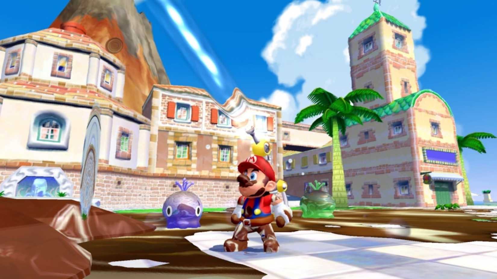
Super Mario Sunshine is the most obvious example, and also the most interesting one. Water isn't just the setting — it's the mechanic, the tool, the entire structural logic of the game. The FLUDD pack turns water from a backdrop into the means of engagement, which is either a natural extension of the era's obsession or a very clever piece of design that meets the moment perfectly. Isle Delfino is a tropical resort, and every level radiates from it. The game is about being somewhere sunny and watery and slightly too good to be true, and it commits to that completely.
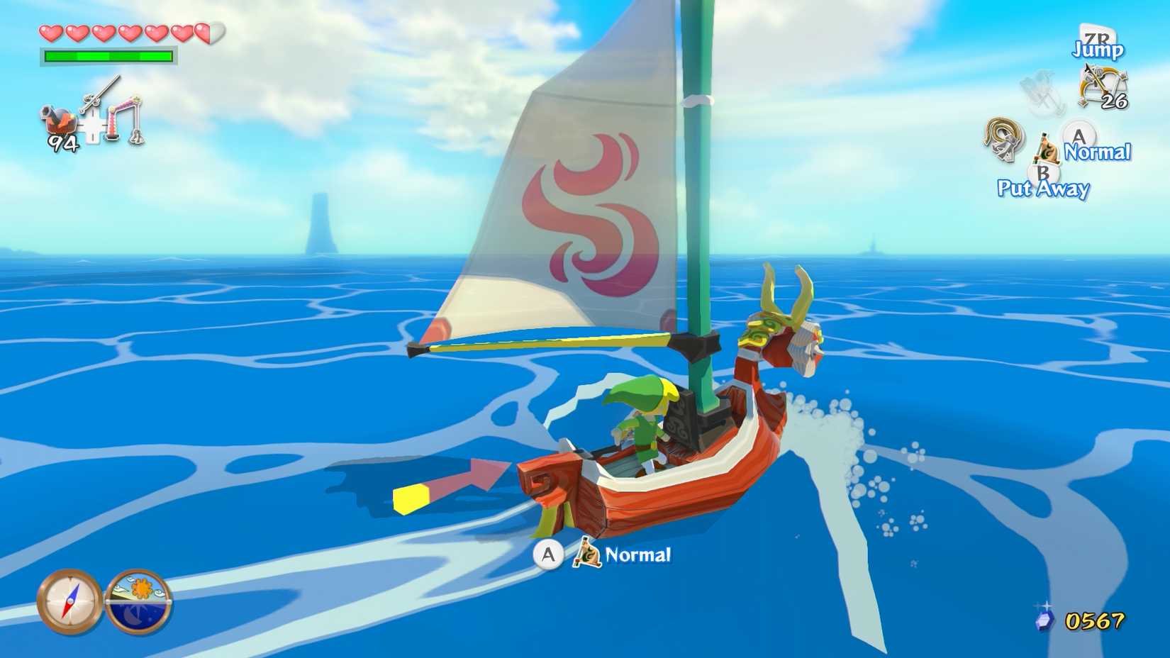
The Legend of Zelda: The Wind Waker goes further still. The entire overworld is ocean. The decision was partly imposed by hardware — a vast, detailed Hyrule Field wasn't viable — but what emerged from that constraint was one of the most distinctive worlds in the series. Sailing between islands with the light changing across the water as you go is something that still holds up visually, when many other more technically ambitious games don’t.
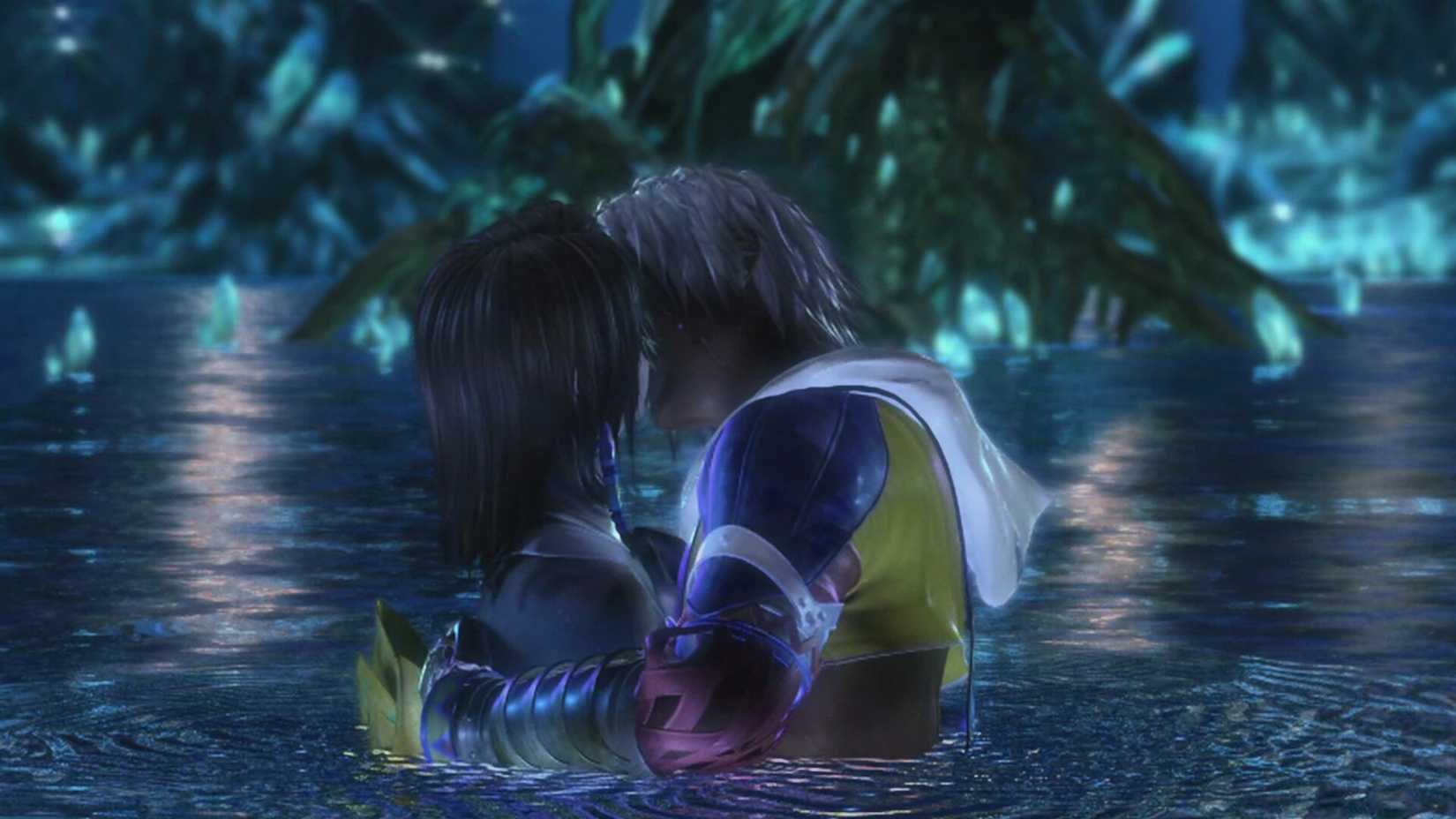
Final Fantasy X is a different register entirely, but the logic is the same. Besaid Island. Kilika. The shorefronts and shallow waters that frame the opening hours. The tropical palette signals something emotionally — warmth, transience, a world worth saving and also worth grieving — and it does it through visual vocabulary that the hardware could actually support. The game's opening chapters are among the most beautiful things on the PS2, not despite the beach settings, but because of them, because the environment and the rendering capabilities were matched to each other.
Jak and Daxter opens on a boat. Kingdom Hearts begins on Destiny Island, a child's idealised version of the same visual language, right down to the wooden docks and shallow turquoise water. Ratchet and Clank visited coastal and oceanic environments throughout the early PS2 titles with enough regularity to make clear the team understood where the hardware sang. All of these games are a collective response to the same set of technical circumstances, arriving at similar conclusions independently.
What the Era Felt Like
 SEGA
SEGAThe early 2000s, especially the period just before the tone of popular culture shifted, had a specific quality to it. Bright, primary-coloured, unselfconscious in a way that became hard to maintain as the decade progressed. The games looked the way Saturday morning television felt. There was an ambient optimism to the palette that wasn't making any particular argument — it was just the natural visual register of the moment, and it happened to align perfectly with what the hardware did best. Even nowadays, it is a common trope in anime to offer some lightheartedness in otherwise deep stories.
The games looked the way Saturday morning television felt.
It's worth noting that Frutiger Aero — the glossy, nature-infused, aquatic visual language that came to define interface design from the mid-2000s onward — arrived after this gaming moment rather than inspiring it. Windows XP's default wallpaper, the glassy icons, the translucent water imagery of mid-decade consumer tech aesthetics: those came later and drew from a cultural well that games like Sunshine and Wind Waker had already been filling.

Related
What Killed the Beach
 Reddit / Epic Games
The Xbox 360 and PlayStation 3 generation brought draw distances that made dense, detailed land environments genuinely workable. Better lighting systems meant that a forest, a city street, a ruined building could carry the same visual richness as a tropical shoreline without the same compromises. The tricks that had made water so useful were no longer necessary, and new techniques that made previously difficult environments viable took their place.
At the same time, the cultural mood shifted decisively. The saturated blues and yellows of the PS2 era gave way to something considerably darker and more self-consciously mature. Realism became the primary aspiration across the industry, and with it came an abandonment of the brightness that had defined the previous era's best work. Tropical islands started to read as childish rather than inviting, which was both unfair and commercially relevant. The audience that had grown up on Sunshine and Wind Waker was being told those games were for younger players now, and the industry largely believed it.
The Thing Nobody Designed For
 Nintendo / Super Mario Wiki
What's interesting in retrospect is how much of this era's visual identity was a happy accident of constraint. Nobody sat down and decided that the PS2 generation would be defined by beaches and ocean light. They decided to use the rendering approaches that were most effective on the available hardware, and the cumulative result was a visual era with a coherent identity.
The limitations produced the aesthetic, and the aesthetic produced something that people still feel warmly about even when they can't articulate why. It looked like somewhere you'd genuinely want to be. It looked like summer, and a specific kind of uncomplicated joy that the era's later years hadn't yet arrived to complicate.
It was, in the most accidental way possible, a design golden age.

Next:
10 Most Graphically Impressive Nintendo Games Of All Time
Nintendo may not be known for cutting-edge graphics, but these games argue otherwise.

Systems
![]()
Released August 26, 2002
ESRB E For Everyone due to Comic Mischief
Publisher(s) Nintendo


![ELDEN RING NIGHTREIGN: Deluxe Edition [FitGirl Repack]](https://i5.imageban.ru/out/2025/05/30/c2e3dcd3fc13fa43f3e4306eeea33a6f.jpg)

 English (US) ·